Project Healthy Minds is a nonprofit organization dedicated to improving access to mental health resources, guiding individuals through the often complex and confusing labyrinth of mental health treatment and support. They approached us with the challenge of completely rebranding their image and web design, encompassing everything from their logo to color schemes and graphic elements.
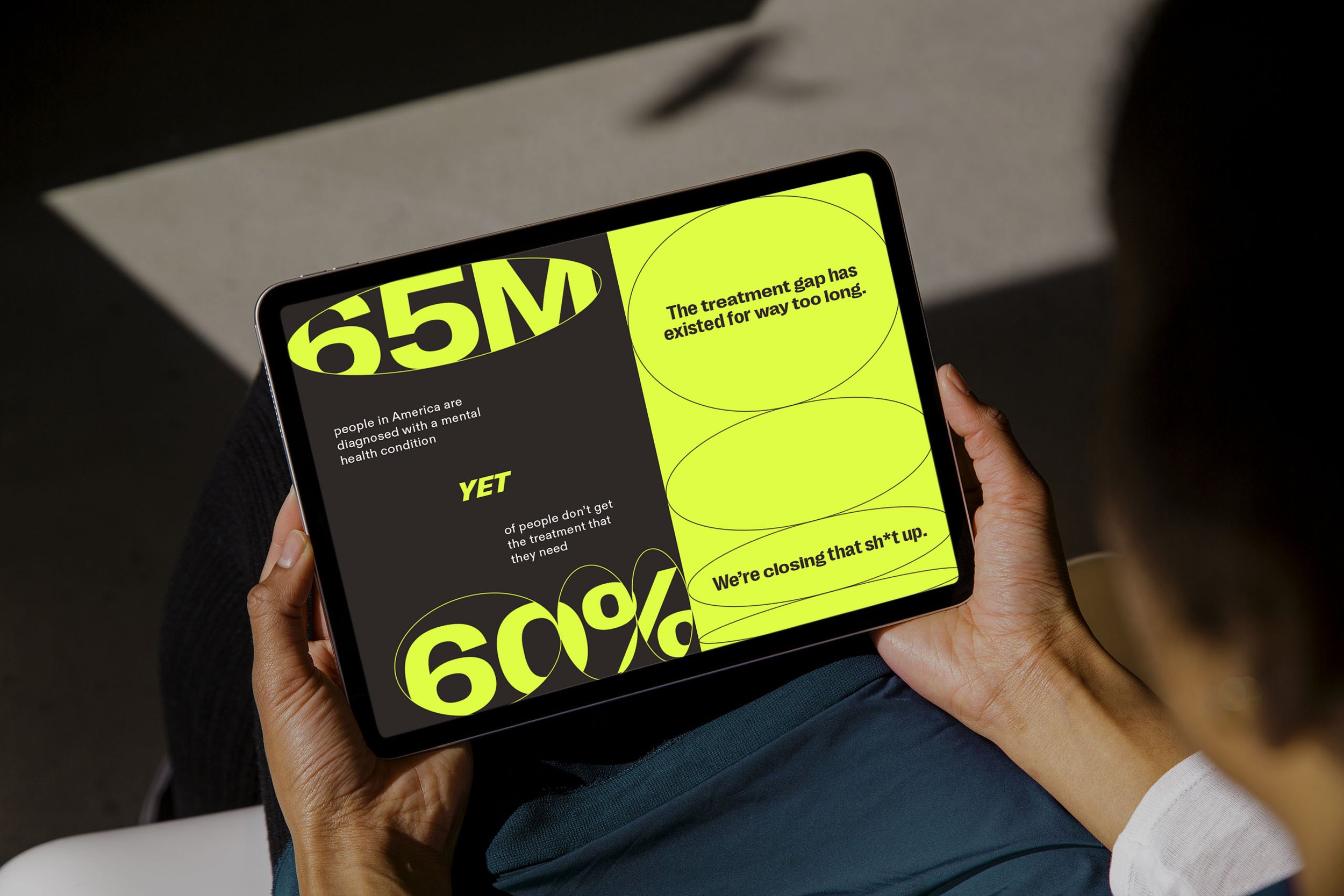
The new brand identity revolves around a simple graphic element: the oval shape, symbolizing the multitude of qualities that the brand stands for — versatility, action, humanity, resilience, open-mindedness, among others. This malleable and flexible shape served as the foundation for a limitless range of visual applications, allowing us to incorporate striking photography and other graphics seamlessly into the brand's identity. We integrated this oval within the simple, all caps wordmark designed based on a modern, condensed sans serif typeface.
Client: Project Healthy Minds
Services: Brand Design
Creative Direction:
Allisan Salazar
Design: Maud Passini, Evelyne Rendon
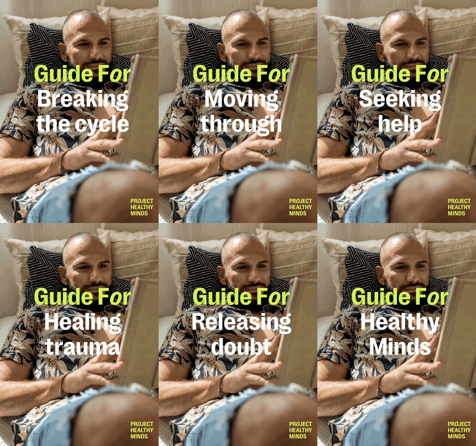
We then opted for a variable brand typeface that can transform from condensed to extra wide, mirroring the multifaceted nature of mental health and the diverse range of individuals affected by it. The core brand colors, black and neon green, were chosen to convey a sense of strength and vibrancy, with additional accent colors such as blue, pink, and light brown to provide a more well-rounded and dynamic visual palette. Our photography approach focused on capturing individuals in natural, spontaneous poses and moments, with an emphasis on optimism.
By blending these elements together, we successfully helped Project Healthy Minds breathe new life into their branding, creating an image that is not only visually appealing but also deeply reflective of their mission to make mental health resources more accessible and relatable to those in need.


